Antipyretics for children are prescribed by a pediatrician. But there are emergency situations for fever when the child needs to be given medicine immediately. Then the parents take responsibility and use antipyretic drugs. What is allowed to give to infants? How can you bring down the temperature in older children? What medicines are the safest?
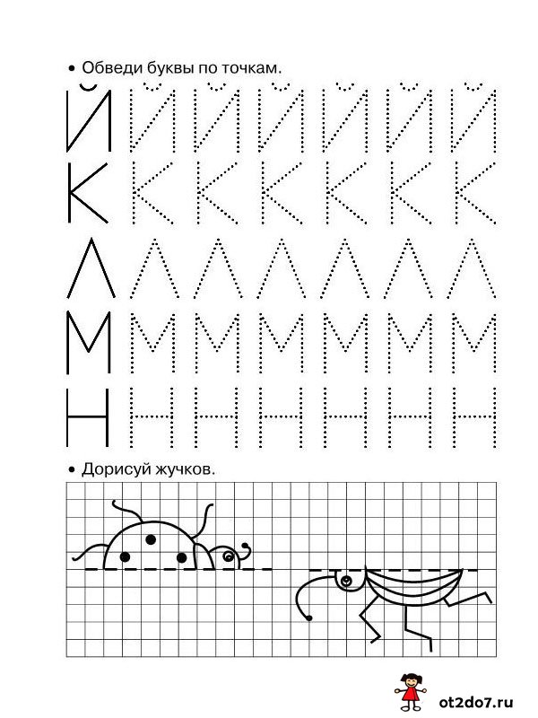
Learning with a child to write block letters in dots. The letters are already written with a dotted line, you need to carefully circle them
Before learning to write in real cursive capital letters, they need to learn how to "print", that is, write in block letters. There are practically no such "copybooks" anywhere, and it is very necessary to teach a child to write block letters.
Print these cards, you can have several copies at once, let the kid train to trace the letters until he gets neat, even lines.
All letters are written with dots, the kid just needs to circle them with a pencil, thanks to such exercises the kid will memorize the letters, as well as learn how to write them correctly


Download file: (downloads: 678)
Dear readers!
All materials from the site can be downloaded absolutely free of charge. All files are checked by antivirus and do not contain hidden scripts.
Pictures in the archives are not watermarked.
The site is replenished with materials based on the free work of the authors. If you want to thank them for their work and support our project, you can transfer any amount that is not burdensome for you to the site's account.
Thank you in advance!!!
Letter dots.
We will write the points at the same distance from each other, not very close and not very far. On the top line of the working line and on the bottom.
The letter is a short straight slanted line.
We start writing from the top line of the working line and draw down a straight inclined line to the bottom line of the working line.
The letter is a long straight slanted line.
1 option. We start writing from the middle of the interline space. We lead down a straight inclined line to the bottom line of the working line.
Option 2. We start writing from the top line of the working line, we draw down a straight inclined line to the middle of the interline space.
The letter is a short straight slanted line with a rounding down (to the right).
We begin to write in the same way as a short straight slanted line. From the top line of the working line we draw down a straight inclined line. Slightly not reaching the bottom line of the working line, we round to the right, bring it to the bottom line of the working line and lead up to the right to the middle of the working line.
The letter is a short straight slanted line with a rounding up (to the left).
We begin to write just below the top line of the working line, lead up to the right, rounding, bring it to the top line of the working line, draw down a short straight oblique line to the bottom line of the working line.
The letter is a long straight slanted line with a rounding down (to the right).
We start writing from the middle of the interline space. We lead down a straight inclined line. Slightly not reaching the bottom line of the working line, we round to the right, bring it to the bottom line of the working line and lead up to the right to the middle of the working line.
The letter is a long straight slanted line with a rounding down (to the left).
We start writing from the middle of the interline space. We lead down a straight inclined line. Slightly not reaching the bottom line of the working line, we round to the left, bring it to the bottom line of the working line, again round to the left just above the bottom line of the working line.
The letter is a long straight slanted line with a loop.
We start writing from the top line of the working line, draw a straight inclined line to the middle of the interline space, round it to the left and, having made a loop, lead up and to the right, crossing the written line on the bottom line of the working line, we finish writing in the middle of the working line.
The letter is a long slanted line with a rounding up and down.
We start writing just below the line space, leading up to the right,
Rounding, we bring to the interline space, we draw down a straight inclined line. Slightly not reaching the bottom line of the working line, we round to the right, bring it to the bottom line of the working line and lead up to the right to the middle of the working line.
Capital letter "A".
We begin to write a little above the bottom line of the working line, round it down to the right and, touching the bottom line of the working line, draw a long sloping line smoothly up; not leading to the next line, we stop and draw down a long straight inclined line to the bottom working line. Without taking your hands off, we begin to write a loop: we lead a little up what is written, round to the left and cross the first element of the letter, not reaching the upper working line, we bend the loop to the right, crossing what is written, we finish a little below the top line of the working line.
Lowercase "a" letter.
The letter "a" consists of two elements: an oval and a short straight slanted line with a rounding at the bottom. We begin to write below the top line of the working line, Lead up, rounding slightly to the left, bring it to the top line of the working line. Then we draw a rounded line down to the bottom line of the working line, lift it up to the right to the beginning of the letter. Then we write the second element - a straight inclined line with a rounding down, which is in contact with the oval.
Capital letter "B".
We start writing a little above the middle of the line space. From top to bottom we draw a long straight inclined line to the bottom line of the working line and round to the left, smoothly moving into a loop, we lead to the top line of the working line, round to the right, write a semi-oval. We write the next element from left to right: in the form of a smooth rounding on the left and turning into a straight, straight horizontal line.
Lowercase "a" letter.
We begin to write in the same way as the letters "o" and "a". Having reached the beginning of the letter, we begin to write the second element: we write a straight inclined line upwards, not reaching the middle of the line space, we make a smooth turn to the right.
Capital letter "B".
We start writing a little above the middle of the line space. We draw a long straight inclined line from top to bottom to the bottom line of the working line and write a loop to the top line of the working line, continue the line up and at the level of the first element we round it to the right down and write a semi-oval to the top line of the working line. Without taking your hands off, we write the second semi-oval from the top line of the working line to the bottom line of the working line.
Lowercase letter "v".
We start writing from the middle of the working line, draw a line with an upward slope, make a loop, up to the middle of the interline space, draw a straight inclined line down, slightly not reaching the bottom line of the working line, round it down to the right and, touching the bottom working line, write an oval. (On (1-4) almost bringing to the upper working line, and on (1-3) touching the upper working line.)
Capital letter "G".
We start writing from the middle of the interline space. We lead down a straight inclined line. Slightly not reaching the bottom line of the working line, we round to the left, bring it to the bottom line of the working line, again round to the left to the middle of the working line. We write the next element from left to right: in the form of a smooth rounding on the left and turning into a straight, straight horizontal line.
Lowercase "g" letter.
We begin to write just below the top line of the working line. We lead up to the right, rounding, we bring it to the working line, we lead down a straight inclined line. Slightly not reaching the bottom line of the working line, we round to the right, bring it to the bottom line of the working line and lead up to the right to the middle of the working line.
Capital letter "D".
We start writing from the middle of the interline space, a smooth rounding to the right, turning into a large semi-oval. Touching the bottom line of the working line, we write a loop to the left and draw up a large straight inclined line without touching the semi-oval.
Lowercase "d" letter.
We begin to write the first element in the same way as the letter “a”. The second element is a straight slanted line. We start writing from the top line of the working line, lead down, bring it to the middle of the line space and make a loop, rounding the line up to the left.
Capital letter "E".
By (1-3). We start writing from the middle of the interline space, draw a rounded line to the left slightly up, rounding down and to the right, not reaching the top line of the working line (according to (1-4) leading to the top line of the working line), we begin to write the second element: we draw a rounded line slightly to the left , then down, not reaching the bottom line of the working line, round to the right, touching the bottom line of the working line, round up to the right to the middle of the working line.
The letter is a lowercase letter "e".
We start writing just below the middle of the working line. We lead the line up with an inclination to the right, almost bringing it to the top line of the working line, round it up to the left, touching the top line of the working line, write a semi-oval to the middle of the working line.
Capital letter "J".
The letters "Ж" and "Ж" are the same in writing, differ only in size. They consist of three elements: two semi-ovals and an inclined line. We start writing below the middle of the interline space, lead up to the right, round down to the left, write a semi-oval. Then we write the connecting element from the middle of the semi-oval to the right up to the middle of the line space, then we write the oblique line and start writing the second connecting element from the bottom point of the oblique line upwards to the right to the middle of the line space. The third element - the right semi-oval - we start writing just below the middle of the interline space, lead up to the left, reach the middle of the interline space, lead down, round to the right, write a semi-oval.
Capital letter "Z".
We start writing just below the middle of the line space. We lead a rounded line to the right down to the top line of the working line, rounding to the left. Then we begin to write the second semi-oval. From the point where we finished writing the first element, we draw a rounded line to the right down, not reaching the bottom line of the working line, round it to the left, bring it to the bottom line of the working line, round it up, slightly rise above the bottom line of the working line.
Lowercase "z" letter.
We start writing just below the top line of the working line, round up to the right, bring it to the top line of the working line, continue to round, lead down to the left, not reaching the bottom line of the working line. The second element is a loop. We start writing just above the bottom line of the working line, round to the right, lead down to the middle of the line space, make a loop (the loop intersects on the bottom line of the working line). We finish the letter a little above the bottom line of the working line.
Capital letter "I".
We start writing from the middle of the interline space, move up to the right, round off and write a long straight sloping line with a rounding down to the right, bring it to the height of the first element without taking our hands off, write a long straight sloping line with a rounding at the bottom. The height of both elements is at the same level. (and-one-and-two).
Letter lowercase "i".
We start writing from the top line of the working line, write a short straight oblique line with a rounding at the bottom, bring it to the top line of the working line and, without taking our hands off, write a second straight oblique line with a rounding at the bottom. (one-and-two-and).
Capital letter "K".
By (1-3). We start writing from the middle of the interline space, draw a small straight oblique line up to the right, then write down a long straight oblique line, slightly not reaching the bottom line of the working line, round it down to the left, touching the bottom line of the working line, write a loop, crossing it with a little written above the upper working line. Then we lead upwards to the right, ending with a slight rounding at the level of the height of the first element. We tear off our hand and begin to write the next element a little above the top line of the working line; we lead a little as written, round up to the right, lead down a straight inclined line with a rounding at the bottom. (You can not explain the beginning in detail, but say that we write the first element, just like the letter “H”).
By (1-4). We explain in the same way, only the loop crosses what is written on the top line of the working line, and the third element _ is a short straight inclined line with a rounding of the top and bottom.
The letter is a lowercase letter "k".
We start writing a short straight inclined line from the top line of the working line, return it up to the middle, then we lead it up to the right and slightly round off on the top line of the working line. There is a small corner between the first and second element. Next, we start writing from the same place where we started the inclined line with a rounding up and down, only a smaller size.
Capital letter "L".
The letter "L" is written in the same way as the capital letter "A", only without the last element.
The letter is a lowercase letter "L".
We begin to write just above the bottom line of the working line, round off, bring it to the bottom line of the working line, then lead up, deflecting the straight line to the right and bring it to the top line of the working line. From the point where we finished the first element, we begin to write the second - a line with a rounding at the bottom. First, we lead down the written, and then we make sure that a corner is formed between the first and second elements.
Capital letter "M".
We start writing just above the bottom line of the working line, round off, bring it to the bottom line of the working line, lead it up and deflecting the straight line to the right, bring it to the middle of the line space, then write a line with a rounding at the bottom and make sure that a corner is formed. Without taking your hands off, we lead up and reject to the right, bring it to the middle of the line space, write a line with a rounding at the bottom to the right.
The letter is a lowercase "m".
Similarly with writing the capital letter "M", only the sizes are smaller.
Capital letter "H".
(1-4) We start writing from the middle of the interline space, draw up to the right a small straight oblique line; then we write down a long straight inclined line, slightly not reaching the bottom line of the working line, round it down to the left, touching the bottom line of the working line, write a loop, crossing what is written on the top line of the working line; we draw a line to the right up, above the working line we make a loop, rounding to the left, the intersection on the top line of the working line and we draw down a straight inclined line with a rounding at the bottom.
The letter of the lowercase letter "n".
We write a short spicy sloping line, return along the written up to the middle, make a small loop (tie a knot), draw a smoothly sagging line to the right to the top line of the working line and write a short straight sloping line with a rounding at the bottom. (one-and-two-and)
Capital letter "O".
We start writing from the middle of the working line, draw a rounded line down to the right to the bottom line of the working line; rounding up to the right, we draw a rounded line, not reaching the next line, smoothly rounding up to the left, then we draw a rounded line down to the left and bring it to the beginning of the letter.
Lowercase "o" letter.
With a lower connection with the next letter, we begin to write from below, with an upper connection - from above.
According to (1-4) only the lower connection.
Bottom connection. We begin to write a little above the bottom line of the working line, round down to the right, touching the bottom line of the working line, make a rounding to the right up; not reaching the top line of the working line, we make a rounding to the left up;
Touching the top line of the working line, round it down to the left and bring it to the beginning of the letter.
Top connection. We begin to write the letter a little below the top line of the working line, lead up, rounding to the left; touching the top line of the working line, we make a rounding to the left down; we draw a rounded line to the bottom line of the working line, rounding up to the right, bring it to the beginning of the letter.
Capital letter "P".
We start writing from the middle of the interline space, draw a straight inclined line down, not reaching the bottom line of the working line, round it down to the left, bring it to the middle of the working line. We tear off our hand, we begin to write the second element - a straight inclined line with a rounding at the bottom to the right. We draw a straight inclined line from the middle of the interline space, almost bringing it to the bottom line of the working line, round it to the right, bring it to the middle of the working line. When writing the first two elements, you need to pay attention to the same height, slope and distance between them. The top element is written from left to right. We start with a small rounding, then draw a straight line to the right.
The letter is a lowercase "p".
We begin to write from the top line of the working line, we lead down to the bottom line of the working line. Without taking your hands off, we lead up as written to the middle of the working line, then up to the right, rounding, bring it to the top line of the working line, round off and draw down a straight inclined line with a rounding at the bottom to the right.
Capital letter "R".
We start writing a little above the middle of the line space. We draw a long straight sloping line from top to bottom to the bottom line of the working line and round to the left. The second element is written from left to right in the form of a rounded line.
Lowercase "r" letter.
We start writing from the top line of the working line, lead down to the middle of the interline space, without taking our hands off, lead up on what is written, bring it to the middle of the working line and write the second element - lead up to the right, rounding, bring it to the top line of the working line, round and lead down slanted line with a rounding at the bottom to the right.
Capital letter "C".
We start writing just below the middle of the line space. We lead a rounded line to the left, then down, cross the top line of the working line, go down, slightly round to the left, bring it to the bottom line of the working line, go up to the right and finish the letter in the middle of the working line.
The letter is a lowercase letter "s".
We begin to write just below the top line of the working line. Lead up, round to the left, bring to the top line of the working line, lead down the rounded line to the bottom line of the working line. We rise up to the right to the middle of the working line.
Capital letter "T".
We start writing from the middle of the interline space. We lead down a straight inclined line. Slightly not reaching the bottom line of the working line, we round to the left, bring it to the bottom line of the working line, again round to the left just above the bottom line of the working line. We tear off the hand, write the second element - a straight inclined line. We start writing from the middle of the interline space, we draw down a straight inclined line to the bottom line of the working line. We start writing the third element from the middle of the interline space. We lead down a straight inclined line. Slightly not reaching the bottom line of the working line, we round to the right, bring it to the bottom line of the working line and round up to the right to the middle of the working line. Pay attention to the same height, slope and distance between the three elements. The top element is written from left to right. We start writing with a slight rounding, then draw a straight line to the right.
Letter lowercase "t".
We start writing from the top line of the working line, draw a straight inclined line down to the bottom line of the working line, without taking our hands off, lead up to the middle of the working line and begin to write the second element. We lead up to the right, rounding, bring it to the top line of the working line, round off and lead down a straight inclined line to the bottom line of the working line, without taking our hands off, we lead up the written to the middle of the working line and begin to write the third element. We lead up to the right, rounding, we bring it to the top line of the working line, we round it and we lead down a straight inclined line with a rounding at the bottom to the right.
Capital letter "U".
We start writing from the middle of the interline space. We lead up to the right, round off, lead down a straight inclined line, slightly not bringing it to the top line of the working line, round to the right; touching the top line of the working line, we draw to the right up to the height of the first element and, without taking our hands off, write a long straight sloping line with a rounding to the bottom left.
The letter is a lowercase "y".
We start writing from the top line of the working line, write a short straight oblique line with a rounding at the bottom to the top line of the work line and, without taking our hands off, write a long straight oblique line with a loop at the bottom.
Capital letter "F".
We begin to write just below the middle of the line space, the first oval, which touches the top line of the working line. Then we write a straight inclined line with a rounding at the bottom to the left, which starts from the middle of the interline space and ends on the bottom line of the working line, and touches the first oval. We begin to write the second oval from a straight inclined line just below the line of the working line.
Lowercase "f" letter.
The letter consists of two ovals and a straight oblique line. We begin to write the first oval as we wrote the letter “o”, then we write a straight inclined line to the middle of the interline space, which touches the oval. We start writing the second oval from an inclined line just below the top line of the working line, lead up to the right, bring it to the top line of the working line, draw a rounded line down, bring it to the bottom line of the working line, round it up to the left and bring it to an inclined line.
Capital letter "X".
We start writing just below the middle of the interline space, lead up to the right, bring it to the middle of the interline space, round down to the left, lead down, slightly not reaching the bottom line of the working line, round off, bring it to the bottom line of the working line and round up to the left without taking your hands off , we lead up the written to the middle of the semi-oval and begin to write the second element. We lead up, round to the right, then we return along the written to the middle of the semi-oval, touch it, lead down, slightly not bringing it to the bottom line of the working line, round it off, bring it to the bottom line of the working line, round it up to the right.
Lowercase "x" letter.
The spelling is similar to writing the capital letter "X", they differ only in size.
Capital letter "C".
We start writing from the middle of the interline space, lead upwards to the right, round off and write a long straight sloping line with a rounding at the bottom to the right, bring it to the height of the first element and without taking our hands off, write a long straight sloping line with a rounding at the bottom, we finish the rounding just above the bottom line of the working line and start writing a loop: draw a straight line down, round to the left, cross the loop on the bottom line of the working line.
The letter of the lowercase letter "c".
We start writing from the top line of the working line, write a short straight oblique line with a rounding at the bottom, bring it to the top line of the working line and, without taking our hands off, write the second short straight line with a rounding at the bottom, we finish the rounding just above the bottom line of the working line and start writing a loop .
Capital letter "H".
We start writing from the middle of the interline space, lead up to the right, round off, lead down a straight inclined line, slightly not reaching the top line of the working line, round to the right; touching the top line of the working line, we draw to the right up to the height of the first element and, without taking our hands off, write a long straight sloping line with a rounding at the bottom to the right.
The letter is a lowercase "h".
We start writing below the top line of the working line, we lead up to the top line of the working line, then we draw a smooth sagging line from left to right again to the top line of the working line, then we write a short straight oblique line with a rounding to the bottom right.
Capital letter "SH".
We start writing from the middle of the line space, move up to the right, round off and write a long straight sloping line with a rounding at the bottom right, bring it to the height of the first element and, without taking our hands off, write a long straight sloping line with a rounding at the bottom right, bring it to the height of the first element and we write a long straight sloping line with a rounding at the bottom to the right.
The letter is a lowercase "sh".
The spelling of the lowercase letter "sh" is similar to the spelling of the capital letter "SH".
Capital letter "Sh".
We begin to write the first three elements in the same way with the letter "Ш". The fourth element - we finish the rounding just above the bottom line of the working line and begin to write a loop (see the letter "C").
The letter is a lowercase letter "u".
The spelling is similar to writing with a capital letter "Sh".
Letter letter "b".
We start writing below the top line of the working line, we lead up to the top line of the working line, then we draw a smooth sagging line from left to right to the top line of the working line, then we write a short straight oblique line with a rounding at the bottom to the right; without bringing to the middle of the working line, we round to the left to the middle of the inclined line.
The letter "y".
By (1-4). We start writing from the top line of the working line, write down a short straight oblique line with a rounding at the bottom to the right; without bringing it to the middle of the working line, we round it to the middle of a straight inclined line; and without taking your hands off, we lead down and to the right along the written oval to its middle, then we draw a line to the right up to the top line of the working line and, without taking our hands off, write a short straight sloping line with a rounding at the bottom to the right.
By (1-3). We start writing from the top line of the working line, write down a short straight oblique line with a rounding at the bottom to the right; without reaching the middle of the working line, we round to the left and, without touching the written straight line, make a small loop, draw the line to the right up to the top line of the working line and, without taking our hands off, write a short straight sloping line with a rounding at the bottom to the right.
Letter letter "z".
We start writing from the top line of the working line, draw down a short straight inclined line with a rounding at the bottom to the right, not reaching the middle of the working line, round it to the left to the middle of the inclined line, write a small oval.
Capital letter "E".
We start writing just below the middle of the interline space, lead up to the right, bring it to the middle of the interline space, write a rounded line, bring it to the bottom line of the working line, round it up to the left. In the middle of the working line, we write the second element - a straight line.
Lowercase "e" letter.
The lowercase letter "e" is similar in spelling with the capital letter "E".
Capital letter "U".
We start writing from the middle of the interline space, draw a small straight line up to the right, then write down a long straight oblique line, slightly not reaching the bottom line of the working line, round it down to the left, touching the bottom line of the working line, write a loop, crossing what is written on the top line of the working line lines, then write an oval.
The letter is a lowercase letter "u".
We start writing from the top line of the working line, we draw down a straight inclined line to the bottom line of the working line; Without taking your hands off, we rise up the written to the middle, make a smoothly sagging line and lead down, write an oval.
Capital letter "I".
We begin to write a little above the line of the working line, round it down to the right, touching the bottom line of the working line, we draw a long straight sloping line smoothly upwards; not reaching the middle of the interline space, we round to the left and write an oval that touches the top line of the working line, without taking our hands off, we draw down a straight inclined line with a rounding at the bottom to the right.
Lowercase "i" letter.
The lowercase letter "I" is similar in spelling with the capital letter "I".
Recipe- a wonderful notion of adults to develop writing skills in children. You can use prescriptions from a very early age, starting from 3 years.
Now you can find a huge number of prescriptions. The main thing is to choose prescriptions for the child, corresponding to his age. On this page you can download and print copybooks for children 3-4 years old, 5-6 years old (preschoolers) and first graders for free.
You should not start classes immediately with numbers, letters and words - it is very difficult. Toddlers aged 3-4 years old will be interested in prescriptions with exciting tasks for attentiveness, accuracy and coordination of movements.
These are recipes with fairly simple shapes, lines, various curls. Let the kid first practice his hand, circling the fragments of pictures, funny hooks and sticks.
The kid must learn to draw various curly and continuous lines evenly and beautifully, try not to tear the pencil from the paper. It's not so easy.
Download recipes for kids
I. Popov's recipes are perfect for kids for the very first lessons. Sticks and hooks are built into the copybook drawings. First, you can color the drawing, and then move on to "lowercase writing."
Download recipes for boys

Funny recipes for children 5-6 years old
For children 5-6 years old, take prescriptions with more difficult tasks. Using these recipes, your child will learn to trace dotted lines accurately, master the first skills of writing and drawing, and gain dexterity when working with a pen and pencil.
Download recipes for children 5-6 years old

Download fun recipes for preschoolers
Recipes for a preschooler will prepare the child for writing, introduce him to the configuration of the letters of the Russian alphabet, and teach him to write letters in cursive. Use the spelling data, and your child will quickly remember the name and spelling of letters.
Download copybook - alphabet for preschoolers

Mathematics recipes with numbers and tasks will help the child learn how to write numbers correctly and get acquainted with the score in advance. By clicking on the link, you can download several types of math worksheets quickly and for free
Download copybooks with numbers

Recipes for schoolchildren
To develop a beautiful handwriting, the child will need a lot of time. But now at school very little attention is paid to the correct and calligraphic writing of letters and numbers. Therefore, you can print out the alphabet for schoolchildren and study additionally. These recipes - without pictures, are aimed at more serious work on teaching writing. In addition to the letters themselves, there are also individual elements of letters in the writing.
Download copybooks for schoolchildren "Alphabet in words"


Russian letters differ from each other not only in style and sound designation, but also in size. Correct spelling follows certain rules. Uppercase and lowercase letters - what every schoolchild knows, especially an elementary school student. But the knowledge gained at school is forgotten very quickly, and adults are unlikely to remember the definitions of these terms.
Uppercase and lowercase letters are two types of graphic icons in writing. Interestingly, the division into such varieties is not in all languages. They are present in Cyrillic, and also in the Greek alphabet, Latin, Armenian. The situation in Georgia is unusual. There are no capital icons (with a specific meaning of use), but certain sections of the text (for example, titles, headings) are typed in large icons. They have small inscriptions, but differ from them in size. In other writing systems, the division into uppercase and lowercase letters does not exist.
For the first acquaintance with them, it is enough to learn a brief information:
- capital - the one that is larger;
- lowercase - one that is smaller in size.
And in order for the information to be remembered better, linger in the head for a long time and not turn into confusion, you need to study the issue deeper, delving into the details.
uppercase
 This is a capital, large, beautiful, initial. The letter sign is increased in size compared to the rest. Most often, it is the only one in the line, it is with it that the sentence begins. In elementary school, children with great diligence learn to draw the first alphabetic character - because it should turn out beautiful.
The first official use of capital letters is seen in the 15th century. However, further research showed that people tried to beautifully arrange the initial characters of the name, surname, sentence long before the beginning of the 15th century. Such graphic icons, decorated with ornaments and curlicues, were called drop caps.
Capital letters inThe text is written only in those cases that are confirmed by spelling rules. The most common of them, which are most often encountered in practice, will be indicated below.
Another definition of "capital" is found in elementary school at the stage of teaching writing. It is less common, therefore it does not appear in dictionaries. It is used only to distinguish between the type of writing, the antonym for the word "capital" is "printed". When a teacher asks to write a word, a sentence, a text in cursive, he means lowercase and uppercase letters. And their choice should take place on the basis of the studied rules.

Lowercase
This is a small letter. In a sentence and text, it is much more common than graphic icons of the previous type. This is explained by the fact that small letters are used several times more often in writing - these are the rules of Russian spelling.
All letters that do not fall under the rules for writing capitals are lined up in one line and have the same height, therefore they are called lowercase.
Note! The stress in the term "lowercase" falls not on the first, but on the last syllable, no matter how much one would like to associate its pronunciation with the pronunciation of the word "line".
Useful videos: how to write uppercase small letters?
Main differences
Uppercase and lowercase letters have a number of differences from each other.
They are as follows:
- Size. The capital letter is about 2 times larger than the small one. This is clearly visible when using a notebook sheet in a wide line: a large letter occupies the entire height of the line, and a small letter fits in half of it.
- Writing. The capital letter has much more details and features of the style, which first-grade students are diligently trying to learn. It is much more complicated than small in outline.
- Frequency of use. The capital letter is found in the text much less often than the small one, because its choice must be justified by certain rules.
Having learned for himself the difference between uppercase and small graphic icons, a person stops confusing these two terms with each other.
Examples
An illustrative example of how the styles of both categories look like.
When comparing the graphic icons next to each other, it immediately becomes clear which of them are CAPITAL and which are lowercase.
Capitalization spelling
In Russian, the use of two types of inscription is subject to the rules of the corresponding section of orthography. According to them, the new sentence begins with a capital character, which seems to lead the army of small, ordinary icons. It shows that the previous thought has ended and another has begun, or simply denotes the beginning of a thought. Direct speech, quotations, each new line of the poem begins with the title.

But there are other, more complex rules that explain the spelling of uppercase and lowercase letters:
- Names, surnames, patronymics of people and adjectives based on them. For example: Andrey Igorevich Yablochkin, Petkin's car.
- Names of animals and adjectives made from them. For example: Tuzik, Murka, Kesha, Fluff, Tuzikov collar.
- Geographical objects, places, names (continents, cardinal points, countries, cities, villages, villages, territories, republics, islands, seas, oceans, rivers, lakes). For example: the Black Sea, the Baltic, the Atlantic Ocean, the city of Moscow, the mainland Africa, the village of Yantarny, the Republic of Adygea.
- Names of firms, companies, shops, enterprises. For example: the Rostvertol plant, the Pyaterochka store, the Belvest shoe company.
- Names of great historical events, the most important documents (World War I, Peter's era).
- Names of publications, works of art, dishes (Murzilka magazine, Moskovskie Vedomosti newspaper, Moonlight Sonata, painting Barge haulers on the Volga, Caesar salad).
- Names of ministries, important state organizations (Ministry of Education, City Duma).
- High positions of great national importance (President, Queen).
- The first word of the names of holidays and important events (Birthday, Christmas, Easter, Victory Day).
- The pronoun "you" when special respect is required.
- Abbreviations - consist entirely of capital icons (KPRF, MLM, SFU).
In all other cases, when the word is not included in the category of proper names, but is a common noun, lowercase are writtenstyles.
Possible difficulties in choosing an option
In Russian, most of the rules are ambiguous and have additional explanations or exceptions.
Important! When the choice of letter size (capital / small) is required to fill out important documents or perform serious tasks, work, it is better to check yourself in dictionaries and reference books.
Possible difficulties in choosing the size of a graphic icon:
- The proper names of mythical, historical, literary heroes, which began to be used in a generalized, figurative sense, to denote a certain character or way of life of people. The rules for writing such words are ambiguous: some are written with a capital letter (Oblomov, Napoleon, Hamlet), others with a lowercase letter (Donquixote, Judas, Hercules, which have become common nouns). A variant of their use is given in the dictionary.
- The names of geographical objects and important historical events, used in a generalized (figurative) sense, have the same distinctions and their own spelling features: Sodom (debauchery), Olympus (top), Kamchatka (last places) and Chernobyl, Mecca, Hiroshima.
- The names of devices, techniques, units of measurement, obtained by the names of their inventors, are written with a lowercase letter. For example: X-ray, volt, pascal and so on.
- and terms where one of the words is a proper name, as well as adjectives composed of them, do not have a large sign (Achilles' heel, Demyan's ear, x-rays).
- Adjectives that were composed by the last name and first name of a person using the suffixes -sk, -ovsk, -insk - are written with a lowercase letter (Dalevsky dictionary, Prishvin prose).
Useful video: lowercase Russian letters
Output
In fact, delving into the material taught in the classroom at an educational institution, the pupil and student master the spelling of graphic signs well, understand the differences and features of their use, which means that they do not have serious difficulties in observing this norm.
The main thing is to remember the definitions, to understand some of the difficulties for yourself. And in case of difficulty, do not forget about the possibility of referring to the dictionary.
In contact with
Every day in writing, a person uses an uppercase and lowercase letter. Previously, only capital letters were used, which were the same height. They had clear boundaries. As writing began to develop, the symbols took on more rounded outlines.
In contact with
What is important to know
In modern Russian, the use of uppercase letters causes problems for many people, since not everyone knows how to write lowercase or uppercase characters. Despite the constant improvement and development of the language, there are a few basic rules that will help determine the spelling depending on what the writer wants to convey.
Basic moments use of uppercase characters:
- the positions indicated in the official document are written with a capital letter;
- the beginning of phrases that contain the words Central, State, International, Russian;
- a separate stylistic use of the words Motherland, Man, Center;
- polite address expressed by a pronoun;
- cult books: the Bible or the Koran;
- abbreviation: Komsomol;
- literary books;
- industrial brands of technical products.
Lowercase characters are written in such cases:

Distinctive features of lowercase characters
There are several differences which you should be aware of:
- Font. The lowercase letter is smaller than the uppercase letter.
- Writing. Capital letters are written with features that are taught at school.
- Use. Small characters are much more common.
Using Symbols in Word
Due to the rapid development of information technology, users often use the Microsoft Office Word program in their work. However, not everyone knows that it is also possible to write lowercase or uppercase characters in it. For this, a combination of certain keys is used.
Features of printing alphabetic characters in Word:
- you need to type the desired text on the computer;
- select it and press the Shift and F3 keys together;
- we get the spelling "lowercase characters of the Russian language";
- if you press them again, you can see the "Lower Characters of the Russian Alphabet";
- if you need to work with the text further, you should press Shift + F3 again.
Capital letters: example
Capital characters are used in such cases:

Capital letters in gadgets
Often when using a smartphone the question arises how to include capital letters. To do this, you need to follow a few simple steps:
- the keyboard opens first;
- a key with an arrow indicating the direction up is selected (the key is usually located on the left);
- a capital letter is written;
- if you want such letters to be all the time, you need to press the button twice in a row.
Recently, many people often confuse When should you capitalize, and when a lowercase letter. This is reflected in the attitude of other people, especially if the mistakes are serious.